Aligning list elements
In this article/video i would like to show you how we can align our ordered and unordered lists on the left side with out text.
The issue, and the “wrong” way of fixing it.
What is it that we are trying to “fix”? Well if you look at the image below you can see that ordered and unordered lists by default have an indent to the left. And if you are anything like me you will want to aling these.
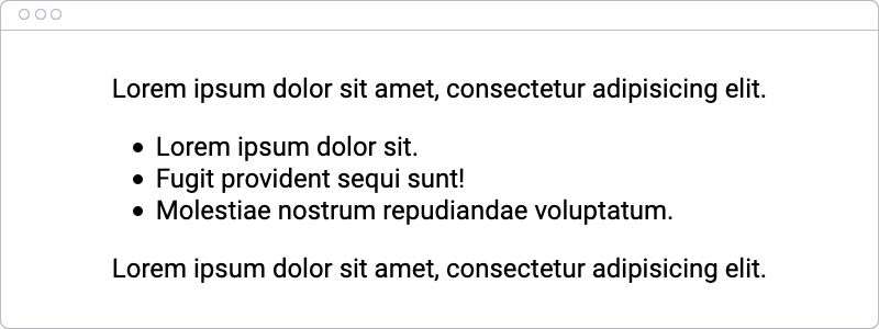
This space on the left side is caused by a padding on the left side of our lists, and that is easy enough to remove.
Removing the padding will result in the image below.
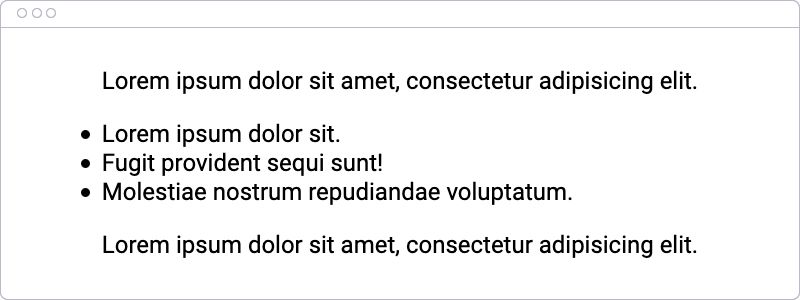
As you can see the bullets are now all the way to the left outside of our text area. To fix that we can add back a little padding by guessing the required amount, like in the code snippet below.
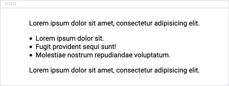
Here we added a padding left of 1.4rem and as you can see in the image below in this case that is just enough.
A better way
But there is a better way. But first let me show you what the exact problem there is.
Here we add a background color of light blue to out list, and that will result in the image below.
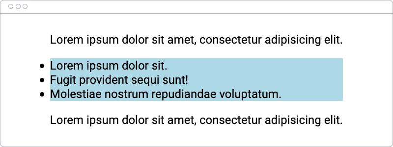
As you can see the problem is that the bullets are outside of our list element. And our problem would be solved if we could move these to the inside of our list. And it turns out that we can do exactly that.
By using the css list-style-position property and setting that to “inside” our bullets move to the inside of our list element, and in combination with the padding of 0 our list align perfectly with the rest of our text.

This is just a simple trick but it is a nice one to add to your reset.css or whatever file you keep your standard styles.
Subscribe and Follow
Subscribe to my Youtube channel.
Thanks for reading/watching and stay safe


